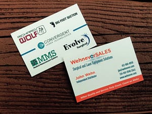
We recently designed a logo and  business cards for Wehenver S.A.L.E.S. It was important that the logo make reference to the client’s last name, Wehn, so we used a little clock in the word Wehnever. The client is in medical equipment sales and much of his business is with medical lasers, so we also tried to incorporate a “laserbeam” into the logo.
Logo Design
Girl Friday Cooking Co. Website & Logo
 Gretchen McNary is one of my most special friends in the whole world…ever, and folks, she is knocking it out of the park with her new business. In case you haven’t heard, she has a cooking business called Girl Friday Cooking Co. She puts out a weekly menu of 4-5 selections, takes orders via her website, and then delivers the orders to several nearby gyms or even to your house! Her food is fresh, made from scratch and packed up in cute little generous single serving containers.
She wanted a logo that evoked that 1960’s era when the term Girl Friday was coined. We tweaked a cute little stock illustration of a woman cooking and added some a funky type to create this fun logo.
Her website, simple as it seems, actually has some power behind it. We are using a great custom form plugin called Gravity Forms to develop a custom menu ordering system each week. If you are already a customer of hers, you know there have been some growing pains, but as we work through them, things are streamlining. Look for more improvements and a new “pay as you order” system soon!
I couldn’t be more proud of all of her hard work!
Running-OM-Green Logo and Labels
 This was a quick and fun project! My good friend, Amy, is just starting a business making juice. It’s called Running OM Green–check out her Facebook Page for info. It’s delicious or should I say OM-azing!
She needed a logo to get started and they we moved into label design. I love how these turned out! The juices are such pretty colors that we went with a clear label to allow them to show through as much as possible. White and light type popped out nicely and matched up with the logo.
